
The
Problem
Users couldn't find things
Kyndryl Bridge users faced significant difficulty navigating across various internal tools and independent services. Leadership wanted a navigation redesign so people could find what they needed.
But this wasn't one product
Kyndryl Bridge is a modular multi-cloud platform. Applications operate independently, but share accounts, identity, and permissions underneath. Each application had grown its own navigation with no shared design language, and the platform still needed to integrate third-party apps without losing user context.
A UI refresh on one screen couldn't fix a structural problem that lived underneath every application on the platform.
What the research actually showed
I ran a comprehensive heuristic evaluation across the platform and mapped existing user journeys to find where people hit dead ends and friction. Working closely with product managers, I analyzed the information architecture to see whether it could support independent applications being integrated into one coherent whole.
It wasn't a navigation problem, it was an orientation problem
The real failure wasn't that features were hard to find inside any single app. It was that nothing on the platform told a user where they were in the larger system, or how to get to the other tools they were already entitled to use. Fixing one app's menu wouldn't touch that.
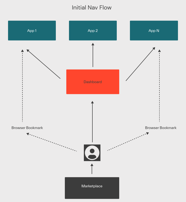
I stopped treating navigation as something each application owned, and made it a shared layer across the whole platform.
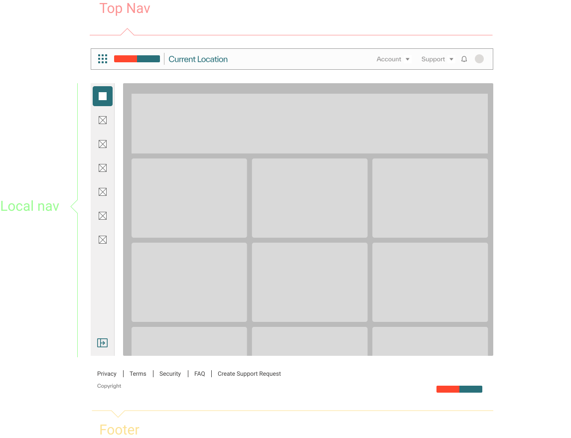
The fix was a strict two-part hierarchy: one global navigation, consistent across every Kyndryl Bridge offering, that handled switching between applications, context, notifications, and account state. And a local navigation inside each application, capped at three nesting levels, so no single app could grow complex enough to disorient the person using it.
One Shared
Layer
High-fidelity Figma prototypes simulated dynamic routing, context switching, and permission-aware states before a line of production code was written. Once validated through unmoderated user testing, the navigation shipped as a standalone React component that any application on the platform could consume.
How It
Works
The mechanics behind the two layer hierarchy.
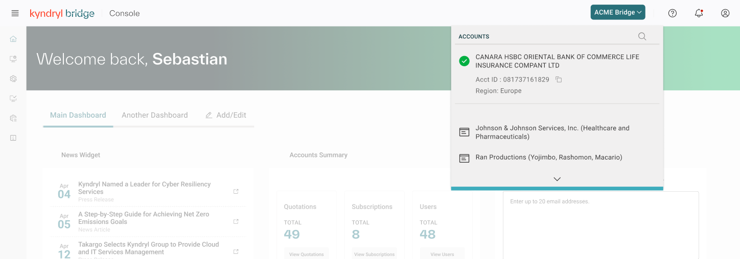
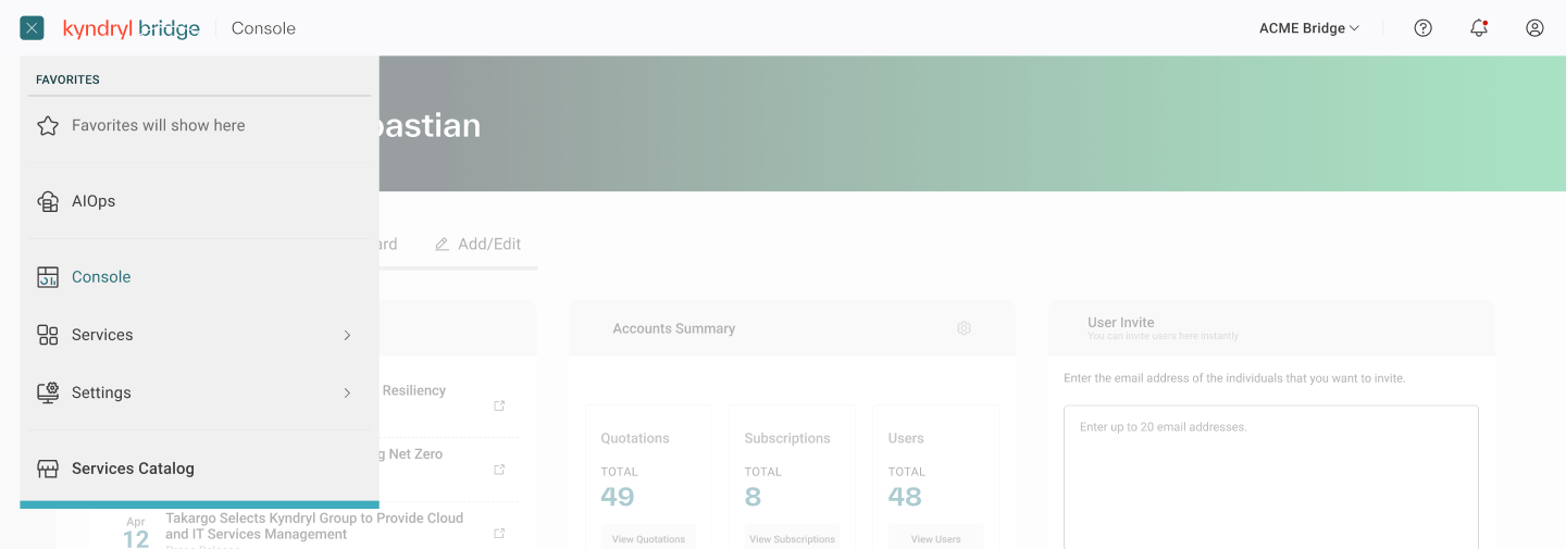
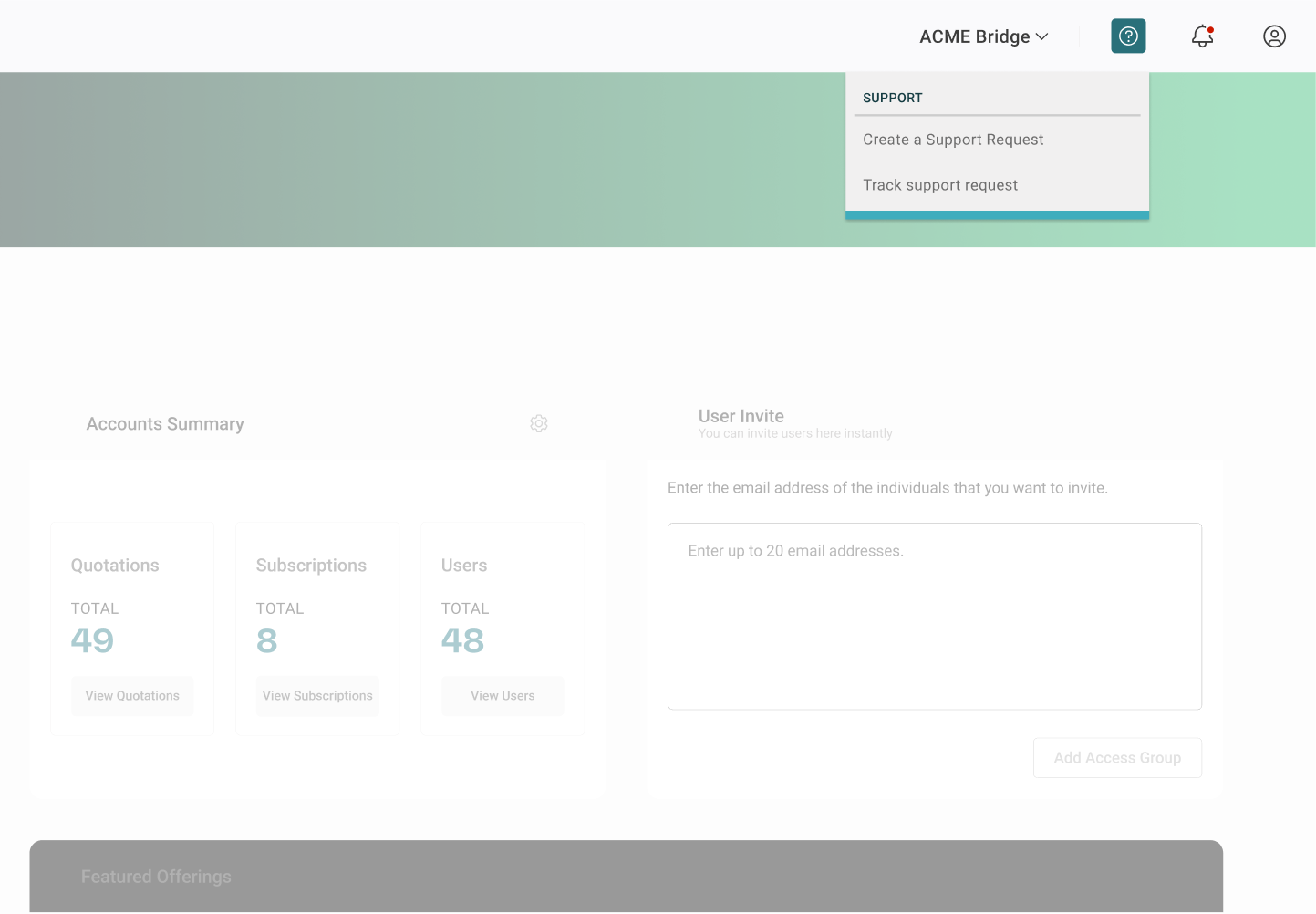
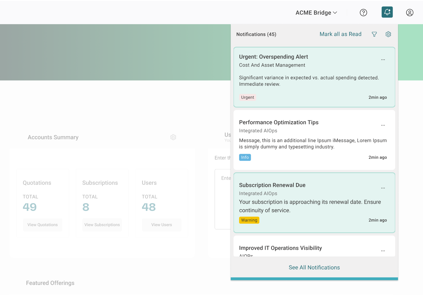
Top navigation is consistent across every Kyndryl Bridge offering: it handles the highest level of platform switching, shows current location, and gives constant access to notifications, support, and the user's profile. Local navigation belongs to each individual application and is capped at three nesting levels, with anything deeper pushed into breadcrumbs inside the content layer, so no application could grow its own menu complex enough to disorient someone.
Maintaining close alignment with development teams from day one ensured the designs were technically feasible and could actually scale as reusable React components, rather than a spec that looked good in Figma and stalled at handoff.
Low-fidelity wireframes established the foundational layout and hierarchy first. Once aligned, high-fidelity Figma prototypes simulated dynamic routing, context switching, and permission-aware states, validated through unmoderated user testing sessions before development. Delivery included comprehensive design-system documentation covering usage guidelines, responsive behavior, and accessibility standards for the global header, utility menus, and local side navigation.
Increase in task completion across key journeys, validated through iterative testing.
Increased usage and signups for previously isolated offerings through unified global routing.
Standardized, accessible React UI patterns shipped for the global header and local navigation across every application.
Looking
Back
What Went Well?
Cross-Functional CollaborationMaintaining close alignment with development teams from day one ensured that our UI designs were technically feasible and could be scaled as reusable React components.
Scalable FrameworkWe successfully delivered a standardized, unified navigation system that seamlessly supports future application integrations and third-party tools.
Improved DiscoverabilityThe introduction of the global App Switcher and Utility Dock drastically reduced user friction, resulting in a 25% increase in task completion across key journeys and driving a 65% increase in cross-app traffic to previously hidden tools.
What Could I Have Done Better?
Testing Complex Edge Cases EarlyWhile our user testing validated the primary workflows, we could have expanded the initial scope of our unmoderated testing to include more diverse edge cases, specifically around complex, multi-tenant permission states, earlier in the prototyping phase.