Color
Mapping
Translating the Kyndryl brand identity into a scalable, accessible digital design system.
Sr Lead UX Designer
IBM / Kyndryl
Led the creation and implementation of the semantic color mapping system for the Cloud C platform.
The Problem
The new Kyndryl brand identity relied heavily on nature, sunsets, and warm tones. However, functional UI requires specific high-contrast colors for states (success, error, warning). The challenge was bridging the marketing brand with functional product UI.
Read details →Methodology
Color Theory Analysis, WCAG Accessibility Testing, Carbon Component Mapping, CSS Tokenization.
Read details →Tools
Figma, Carbon Design System, GitHub, Storybook, Adobe Illustrator.
Accessibility
Achieved full AA contrast compliance across all functional UI components in both themes.
Consistency
Standardized semantic CSS tokens ensuring UI consistency across dozens of modular apps.
what went well?
- Bridged brand & UI functionality
- Strict WCAG AA compliance
- Seamless Developer Handoff
- Scalable Token Architecture
Requirements
Analyzed the base Carbon Design System (Gray 10/100) to map Kyndryl's new core and accent brand colors.
Read details →The Solution
Created a robust, semantic token architecture linking global color variables to specific component states.
Read details →Validation
Rigorously tested the new color environments across light and dark modes for visual clarity and accessibility.
Read details →1.- The Problem
As the transition separated Kyndryl from IBM, a completely new brand identity emerged. The new brand guidelines relied heavily on nature, sunsets, and warm, blended tones to communicate its message. While beautiful for marketing materials, translating this into a functional product UI presented a massive challenge.
Functional UI requires specific, universally understood, high-contrast colors to indicate states—such as red for errors, green for success, and yellow for warnings. The core problem was maintaining the emotional essence of the new brand while ensuring functional clarity, usability, and strict accessibility compliance within the platform.

2.- Requirements Assessment
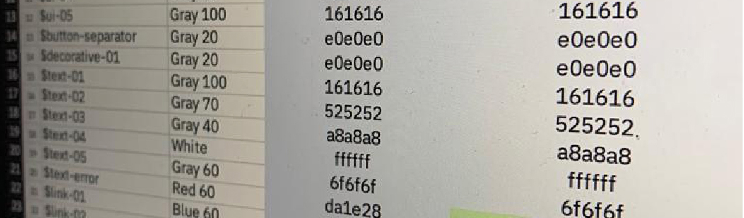
The foundation of the platform was built upon the Carbon Design System v10. We specifically needed to adapt and overwrite the native "Gray 10" (Light Mode) and "Gray 100" (Dark Mode) themes.
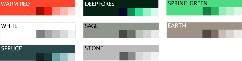
We began by mapping Kyndryl’s new brand colors—Core, Support, and Accent tones—directly against the functional requirements of the UI components, identifying where brand colors could replace standard Carbon grays and blues without breaking the system's underlying logic.

3.- The Solution
To solve the gap between brand and UI, we engineered a semantic token architecture. Instead of hardcoding hex values into components, we created a tiered system:
- Global Tokens: The raw, base color palette defined by the brand team.
- Semantic Tokens: Aliases that describe the intent of the color (e.g.,
$ui-background,$interactive-primary,$support-error). - Component Tokens: Specific applications of semantic tokens to individual UI elements.
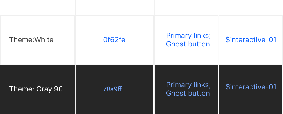
This approach allowed us to seamlessly flip between Light and Dark modes. A single semantic token, like $text-primary, would automatically pull the correct dark-gray hex in Light Mode, and the correct light-gray hex in Dark Mode, ensuring engineering implementation was foolproof.
4.- Testing Environment and User Validation
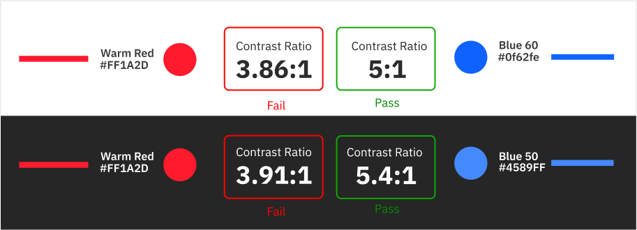
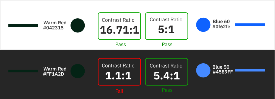
Accessibility was non-negotiable. Every semantic token mapping was rigorously tested against WCAG 2.1 AA standards to guarantee a minimum contrast ratio of 4.5:1 for standard text and 3:1 for large text and UI components.
We created a testing environment in Figma utilizing various Carbon components (buttons, notifications, data tables) to visualize how the brand colors behaved across both themes, allowing us to tweak the luminance of our support colors (reds, greens, yellows) until they passed contrast checks without losing their brand identity.