Dashboard
Landing
Redefining static landing page into a dynamic personalized dashboard
Sr Lead UX Designer
IBM / Kyndryl
Lead research, prototyping, and UI design. Coordinated multi-team collaboration, widget guidelines, and design system standards.
The Problem
Enterprise Design Thinking, Business Needs Assessment, Document Analysis, Subject-Matter Expert Interviews, Wireframing, Prototyping, User Testing.
Read details →Methodology
Enterprise Design Thinking, Business Needs Assessment, Document Analysis, Subject-Matter Expert Interviews, Wireframing, Prototyping, User Testing.
Read details →Tools
Box, Mural, FigJam, Webex Meetings, Jira, GitHub, Sketch, Figma, Adobe Illustrator, Adobe Photoshop.
Daily usage
Redefining static landing page into a dynamic personalized dashboard.
Completion time
Redefining static landing page into a dynamic personalized dashboard.
what went well?
- Successfully secured leadership buy-in
- Leadership Pitch
- Improved Engagement and Efficiency
- Increase in Daily Usage
- Platform wide Guidelines
Info. Architecture
Designed for modular applications sharing unified accounts, users, and permissions.
Read details →UI Design
Standardized UI guidelines and pipeline for cross-functional engineering delivery.
Read details →SME Research
Mapped real-world workflows to uncover navigation challenges and group related tasks.
Read details →The Problem
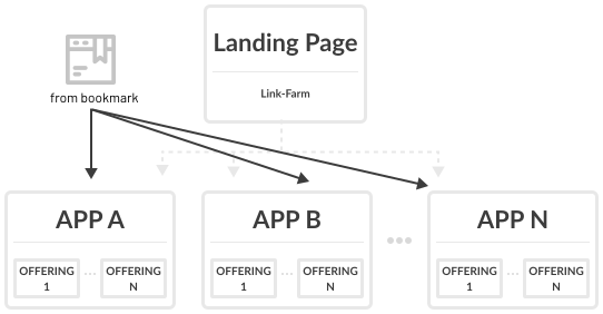
The existing landing page functioned primarily as a static link farm intended to assist new users. However, user engagement was low, with less than 5% utilizing the landing page regularly. Many users favored bookmarking specific offerings in their browsers, indicating that the static landing page did not provide a meaningful or personalized experience.
Beyond the low usage rates, the landing page lacked relevance for returning users, offering no functionality to address their specific workflows or frequent needs. For many, navigating the platform required repetitive steps that the landing page failed to simplify or streamline.
Requirements Assessment
Kyndryl Bridge is a modular multi-cloud management platform where applications operate independently but share common elements like accounts, users, and permissions. Because a static link farm couldn't adapt to these diverse use cases, I made the decision to pivot the project into a dynamic, personalized user experience.
Research
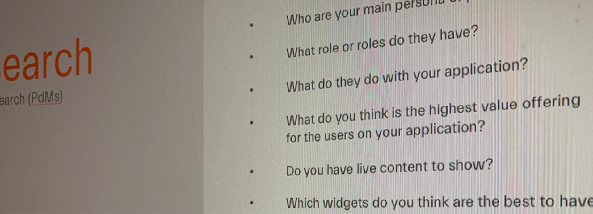
- Subject Matter Interviews: Engaged with delivery partners, product owners, UX designers, and development managers to gather insights about user needs, platform pain points, and how applications were managed and used.
- User Interviews: Confirmed low usage of the landing page and redefined user journeys based on real-world workflows, uncovering navigation challenges and inefficiencies.
- Pattern Identification: Analyzed user journeys across diverse personas to identify common paths, frequent tasks, and usage patterns, reinforcing the need for a more personalized and efficient starting point.
Solution & Prototyping
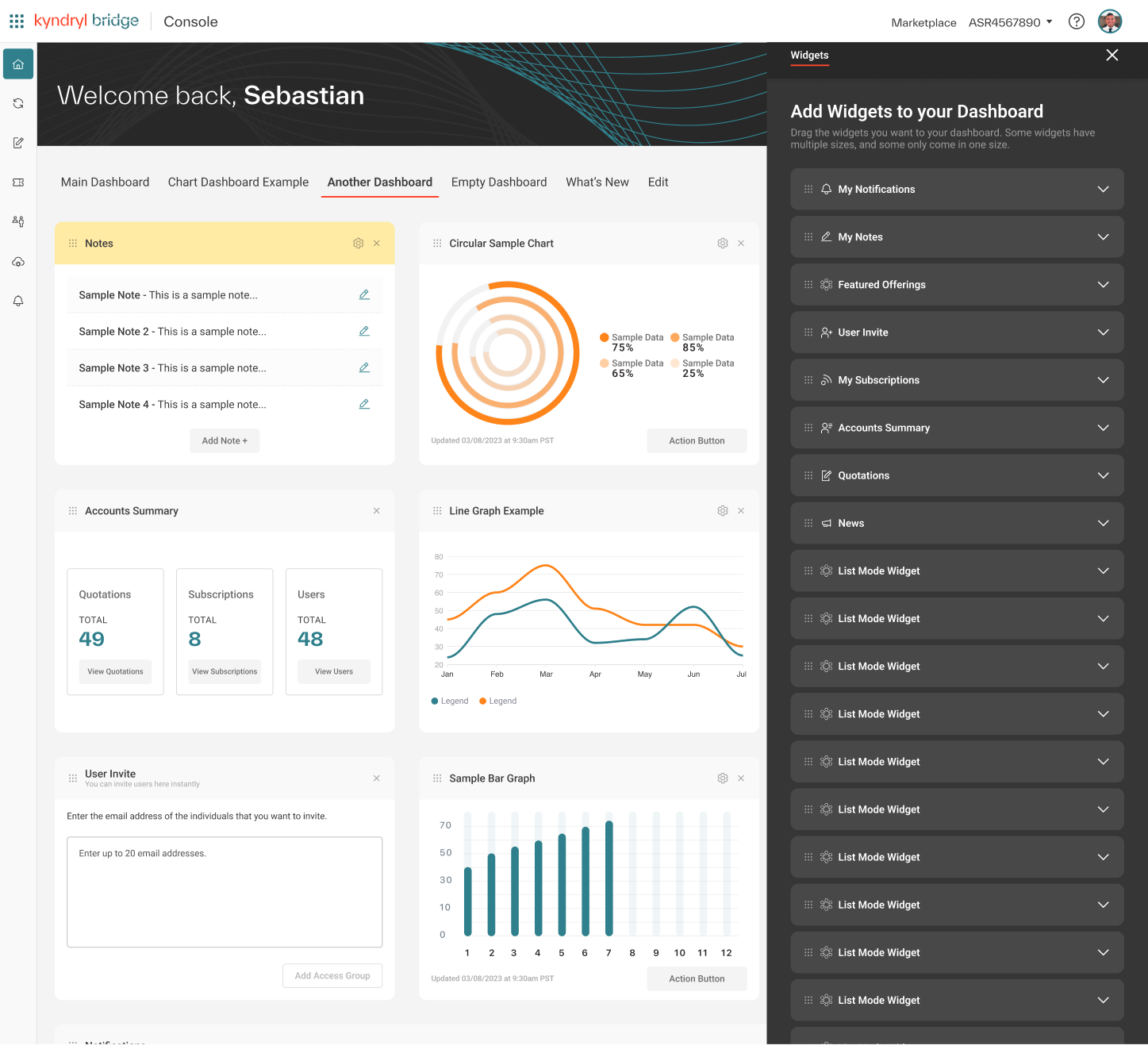
Created detailed user journeys that illustrated how different personas would interact with the platform, highlighting key navigation improvements and workflow efficiencies. Developed low-fidelity mockups to visually represent the concept of a dynamic dashboard. These were used to pitch the idea to leadership, successfully securing buy-in for a more resource-intensive and impactful solution.
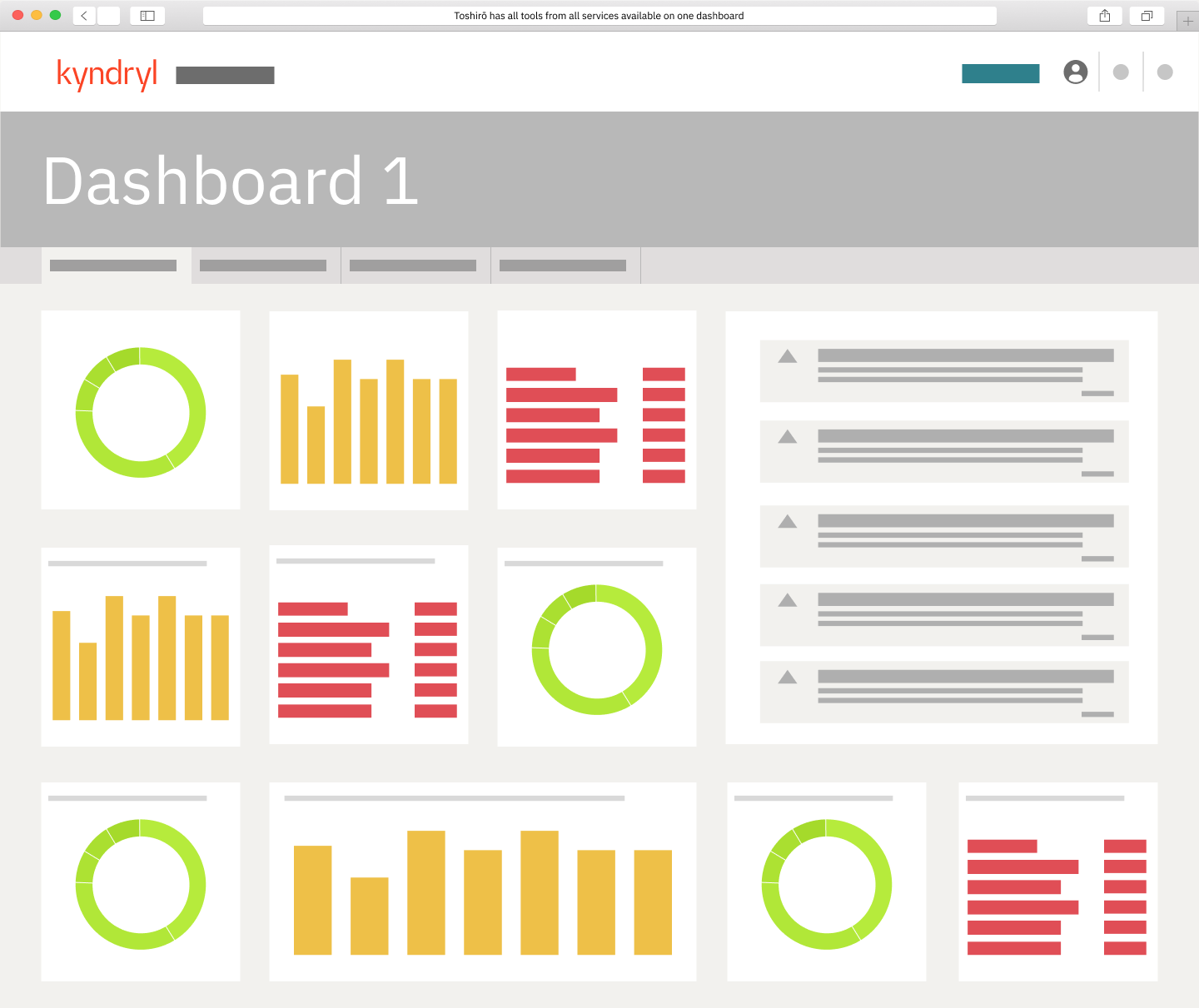
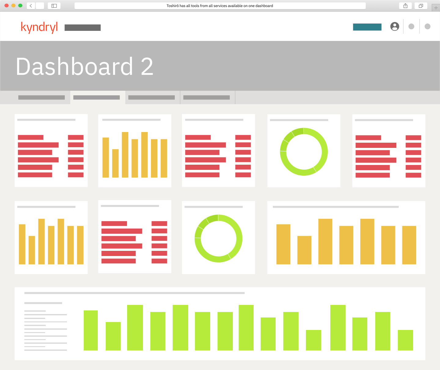
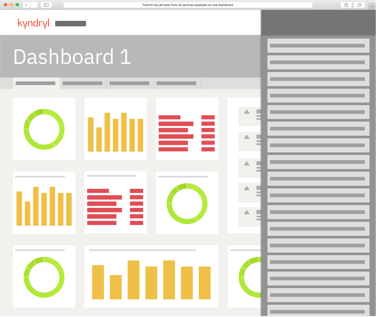
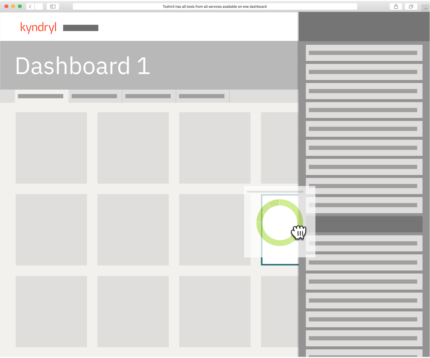
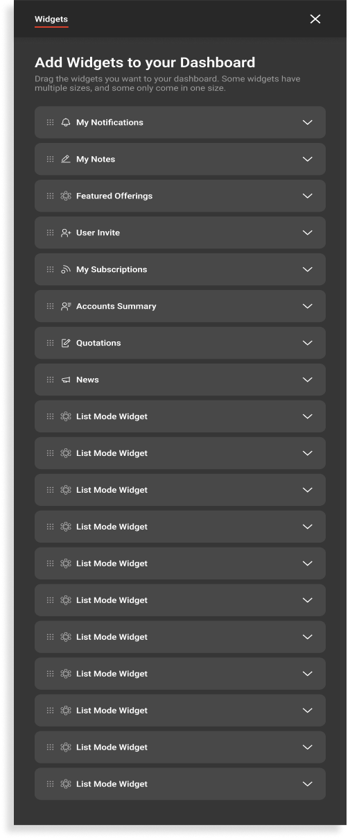
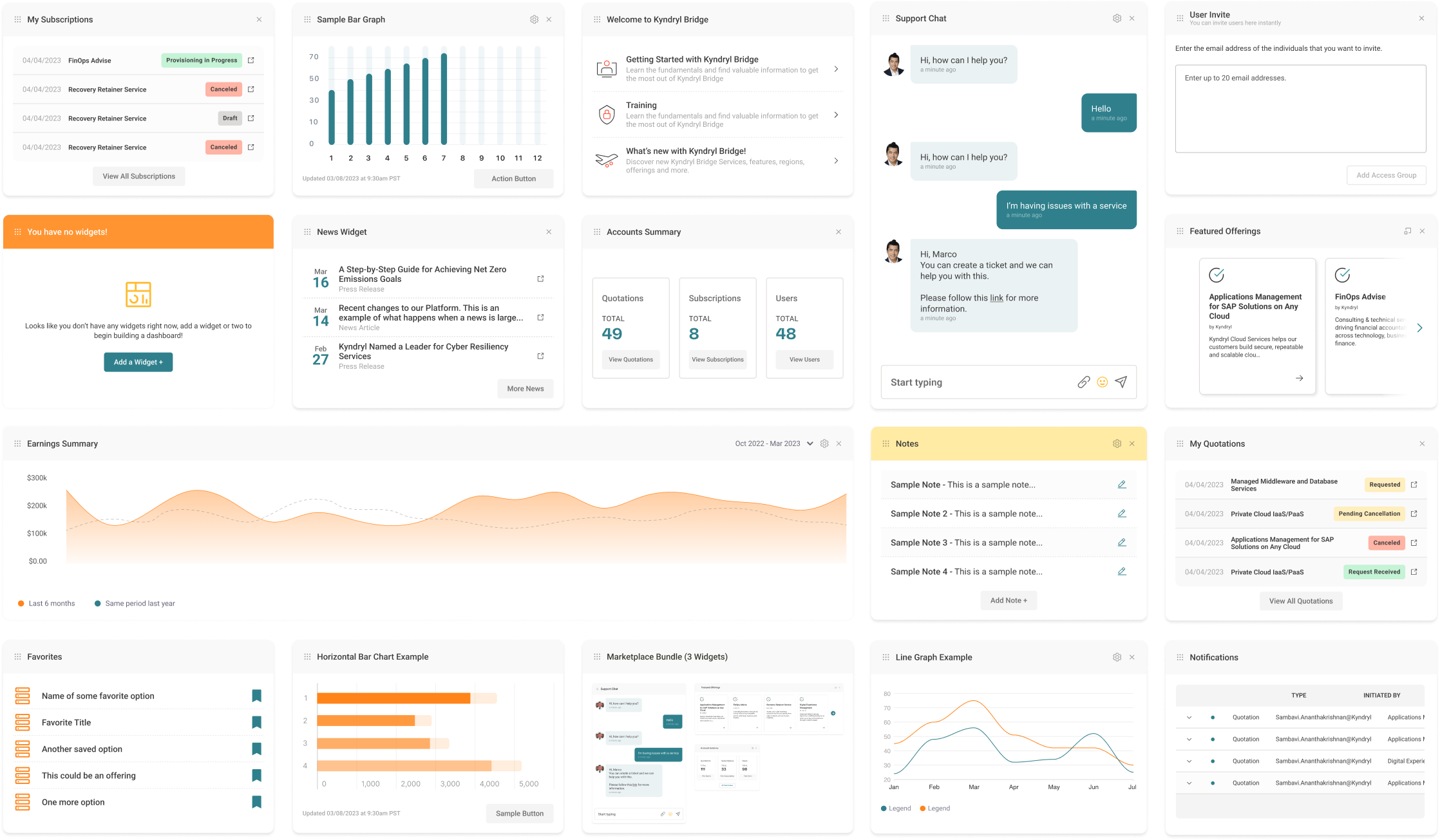
Designed mid-fidelity prototypes in Figma, explicitly defining the dashboard’s key functionalities: Fully Customizable Layouts, Multi-Dashboard Capability, Widget Library contributions, and Permission-aware sharing limits.
Standardization & Delivery
Coordinated a multi-team effort to educate stakeholders on widget creation and usage. Established widget design guidelines and documentation to ensure consistency across applications. Defined a clear process for widget design and development, including approval workflows and quality assurance checks.