

Navigating
Seamlessly
Unifying the multi-cloud experience through scalable global navigation.
Sr Lead UX Designer
IBM / Kyndryl
Led the heuristic evaluation, information architecture, and UI redesign of the platform's global navigation.
The Problem
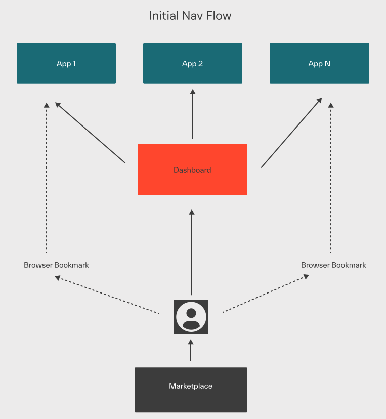
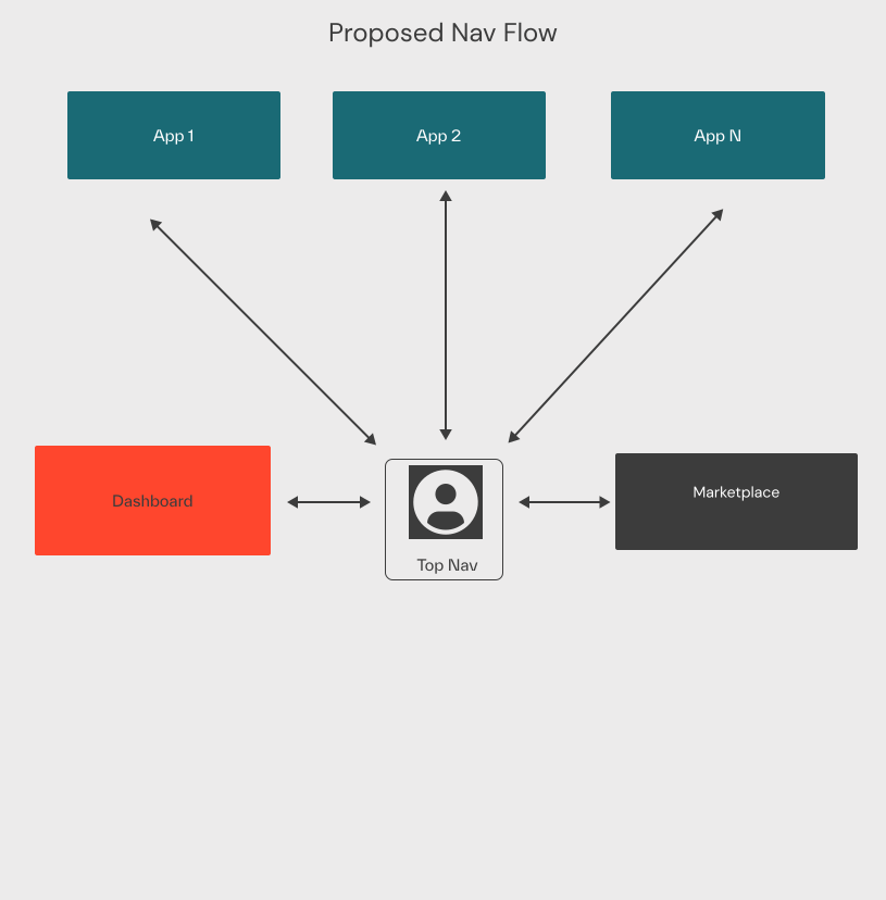
Users faced difficulties navigating across various independent services, resulting in a fragmented experience. The platform needed a unified global navigation that could adapt to user permissions and seamlessly integrate third-party apps.
Read details →Methodology
User-Centered Design, Navigation Heuristic Analysis, Information Architecture, Prototyping, Usability Testing.
Read details →Tools
Mural, Figma, Webex Meetings, Jira, GitHub, Slack, Teams, Adobe Illustrator, Adobe Photoshop.
Task success
Improved discoverability and wayfinding across all unified platform services.
App Discovery
Increased usage and signups for previously isolated offerings through unified global routing.
what went well?
- Stakeholder alignment on architecture
- Scalable navigation guidelines
- Improved feature discoverability
- Consistent 3rd-party app experience
Heuristic Analysis
Evaluated existing fragmented navigation to identify user pain points and structural inconsistencies.
Read details →Info. Architecture
Restructured the global taxonomy to support permission-aware, dynamic routing across modular apps.
Read details →UI Prototyping
Delivered standardized, accessible UI patterns for the global header and local navigation components.
Read details →The Problem
Kyndryl Bridge users faced significant difficulties navigating across various internal tools and independent services, resulting in a highly fragmented user experience. Applications acted as silos without a cohesive design language. The platform desperately needed a unified global navigation that could adapt to complex user permissions, scale for future growth, and seamlessly integrate third-party applications without losing user context.
Stage 1 - Research
I began by conducting a comprehensive Heuristic Evaluation across the platform. We mapped out the existing user journeys to identify severe pain points, dead ends, and areas of friction. Working closely with product managers, we analyzed the information architecture to ensure that the new structure could support the seamless integration of completely independent applications.
Framework Definition
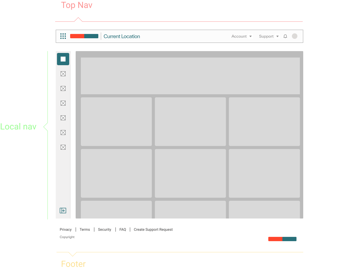
- Top Nav: It’s consistent across all KB offerings. Handles all global navigation interactivity, navigates on the highest level of the platform allowing users to switch in between offerings, displays current location, allows change context on content, access to notification, support and user profile.
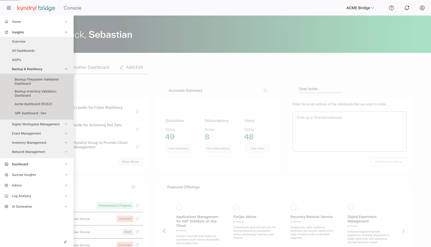
- Local nav: It’s the content navigation menu for each offering. Allows user to navigate local through the content of the current KB offering. Has up to three nesting level of item.
- Content: It’s the main dish, the most important part of the platform as it gives users meaning to being on the platform.
- Footer: Provides users with easy access to supplementary information and resources that are not the primary focus of the main content, such as Privacy, Terms, Security FAQs and also allows user to have a second access to create support requests. It also serves as a visual cue to indicate the end of the main content, providing a sense of completeness and closure to the browsing experience.
Stage 2 - Prototyping and User Testing
We developed low-fidelity wireframes to establish the foundational layout and hierarchy. Once aligned, I created interactive high-fidelity prototypes in Figma to simulate dynamic routing, context switching, and permission-aware states.
We then conducted unmoderated user testing sessions to validate these new navigation patterns, ensuring that discoverability was vastly improved before moving into development.
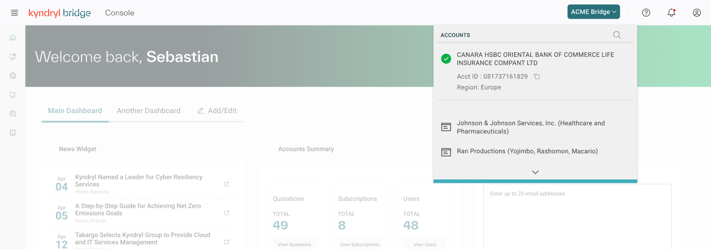
Top Navigation Features
The top navigation serves as the primary anchor point across the entire platform, unifying applications that previously lacked any visual or structural connection.
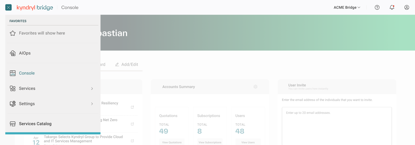
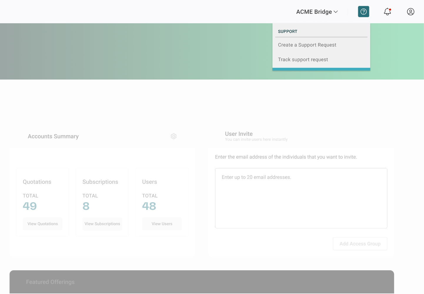
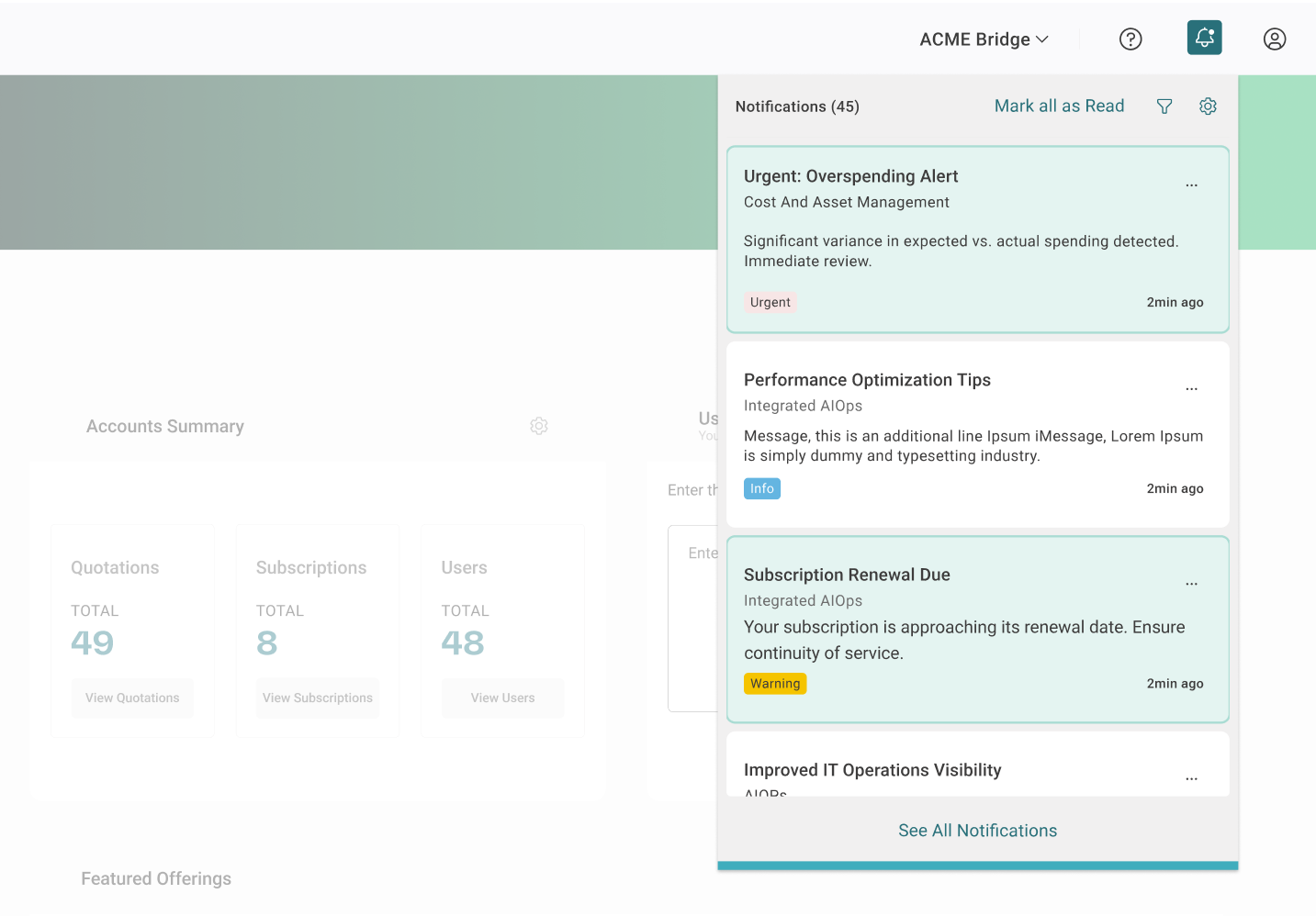
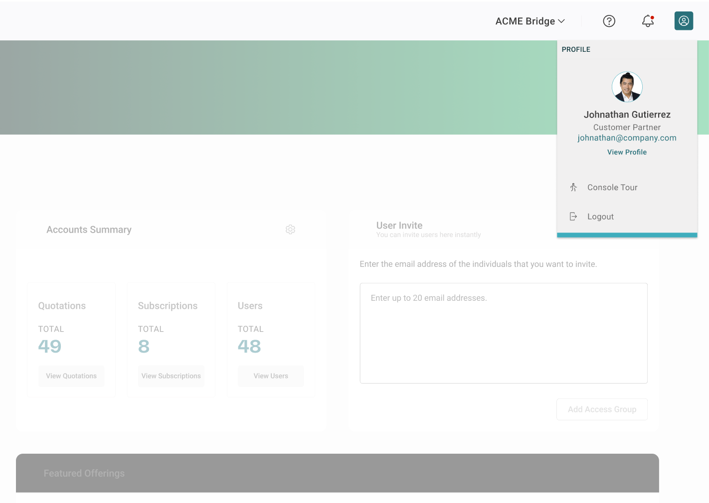
Utility Dock
Provides constant, global access to critical platform tools regardless of which application the user is currently operating within.
Local Navigation Features
The secondary navigation serves as the local anchor for specific applications. It contains tabs for pages within an app, contextual actions, and a breadcrumb trail to support deeper hierarchy and wayfinding without cluttering the global header.
Stage 3 - Implementation
Implementation required deep, ongoing collaboration with engineering teams to ensure the final product matched the prototype's intent. We built the navigation as a standalone, consumable React component that could be injected into any application. I provided comprehensive Design System documentation, detailing usage guidelines, responsive behaviors, and accessibility standards for the global header, utility menus, and local side-navigation.
Stage 4 - Iterative Enhancements
Based on post-launch analytics and direct user feedback, we continuously refined the navigation. This included optimizing the search algorithm's placement, enhancing the visual hierarchy of the notification center, and refining the mobile-responsive behavior for tablet users in the field.